

The 5 levels of customer awareness, and the presell page each one needs
Someone who has never heard of the problem and someone comparing prices need a different first sentence. Here is how to tell them apart, and what to show each one.
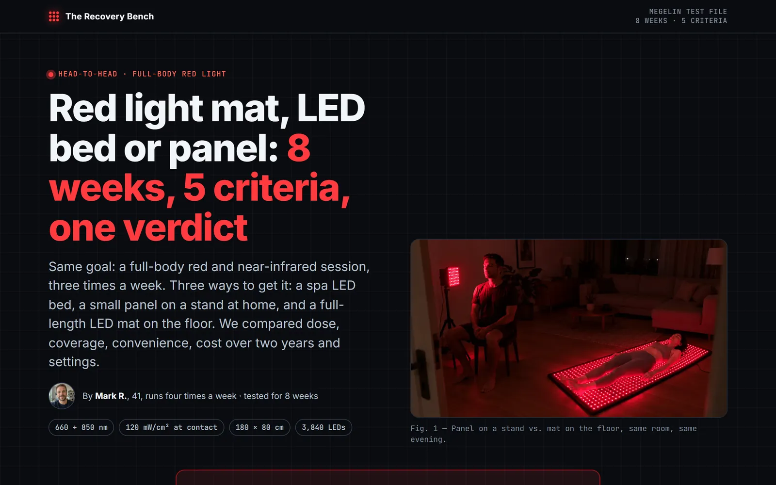
You versus the alternatives, criterion by criterion, with a clear winner.
A side-by-side page: your product against the alternatives your buyer is already considering, criterion by criterion, with a clear conclusion.
The question the buyer is already asking.
What to look at, and why.
Your product and the alternatives, line by line.
Who each option suits.
Reviews and facts that back the table.
With the offer.
Further reading
Someone who has never heard of the problem and someone comparing prices need a different first sentence. Here is how to tell them apart, and what to show each one.
People who compare are close to buying. The page that wins them is the one that helps them decide, admits what the other options do better, and still makes your product the obvious choice for the right reader.
An interactive landing page example should show the question, the rule that selects a result, and the next action. For a product quiz, write the result before building the questions. Then check whether each answer changes a useful recommendation or merely adds a screen between the visitor and the product.
FAQ
People who already know the options: retargeting audiences, searchers comparing products, viewers of an ad that names the choice in its first line. For colder traffic, start with a story or a quiz. Details in comparison landing pages.
Say it. Conceding one criterion makes the other verdicts believable. In the live example, the page gives coverage to the spa bed.
Yes. A cost-over-time calculator can sit inside the page, as in the live example, and it runs in the visitor’s browser.
“We tested 7 of them.” The options your buyer is weighing, held to the same criteria, with yours on top.
“7 reasons why…” A scannable rundown that knocks objections down one by one.
Hero, bundle, proof, guarantee, FAQ: a focused bridge between the ad and the checkout.
Paste the product link, then pick this format in Guided mode. Try it free, no card.
Create this lander